Improving Ops for Designer Growth and Career Success

You need great people to do great work. At the heart of a healthy organization is a plan for the future of every individual. Leveraging data visualization to monitor and manage designer performance was a much needed and welcomed approach to proactively supporting the careers of everyone on our team.

The Challenge

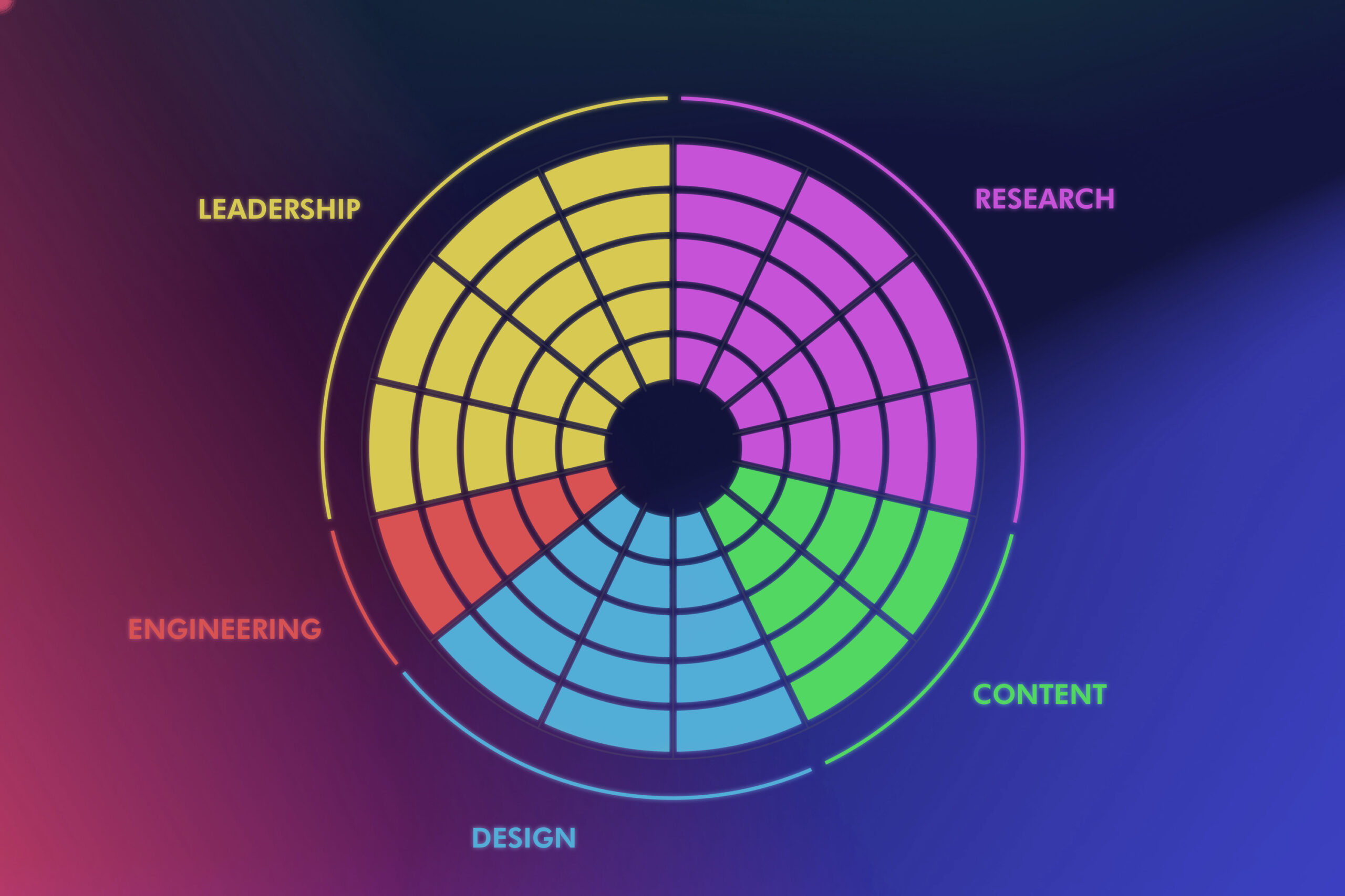
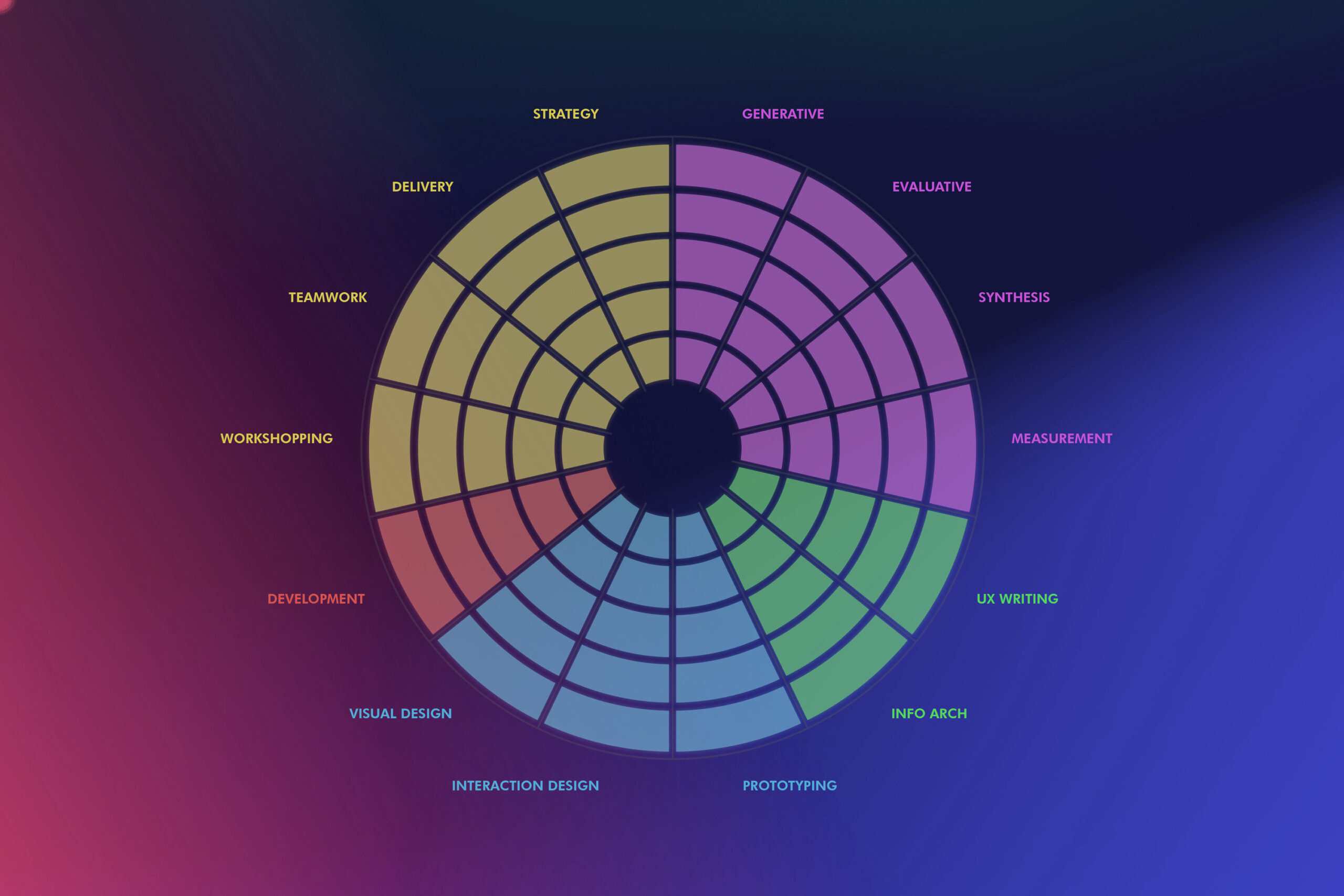
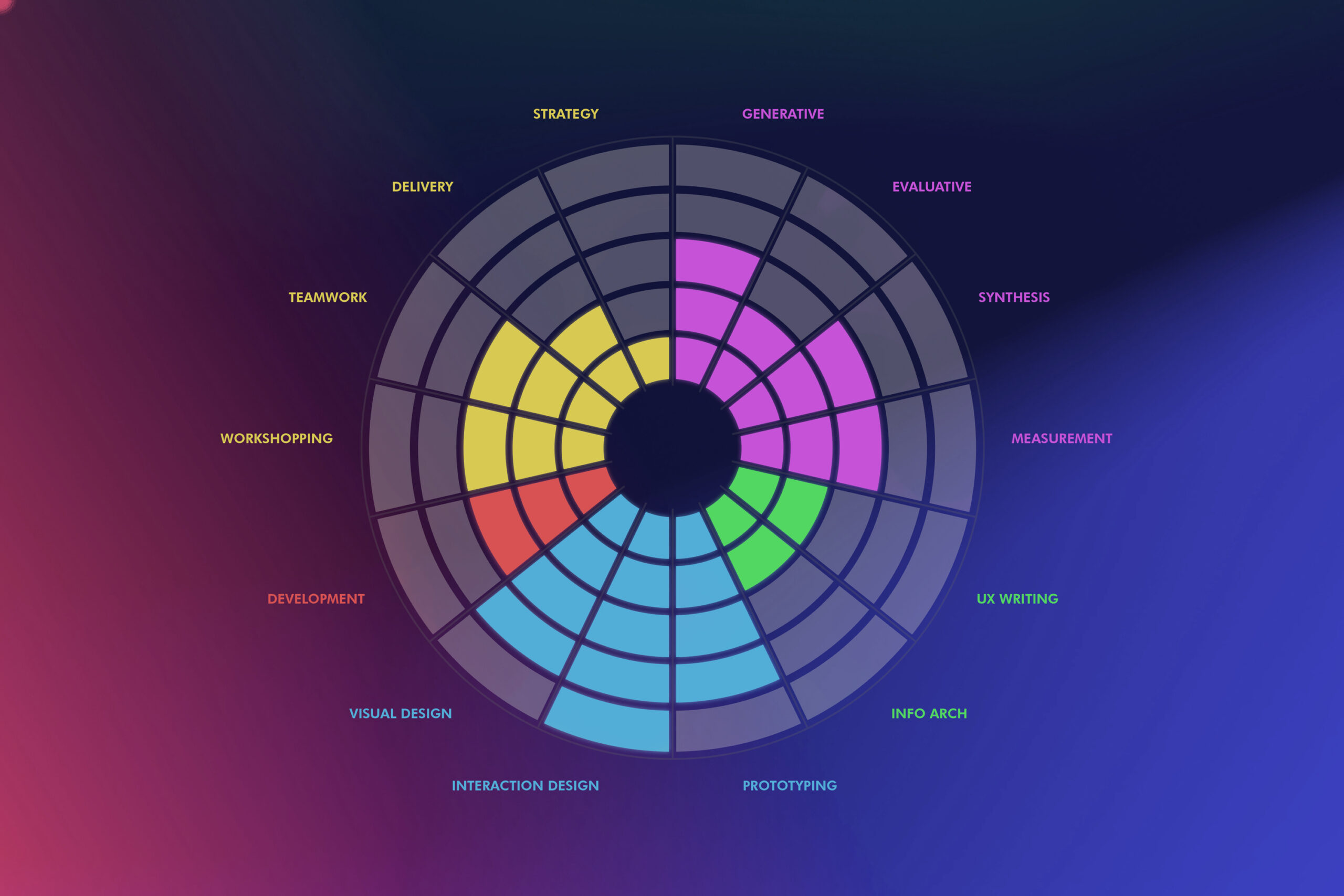
Effectively leading designers requires a solid plan for their careers and growth. But designers are primarily contributors to cross-functional product teams, and it can be challenging to isolate their individual efforts. Additionally, there’s no obvious, objective way to determine quality of work and competency of skill while factoring in the peculiarities of unique teams and individuals. Nevertheless, as their leader, they will come to you and ask for advice on where to grow and how to advance their career. This poses an interesting and complex problem to solve. 

As the leader of a product design team, my goal was to figure out a way to operationalize designer growth

I had a ton of questions needing answered, including: 

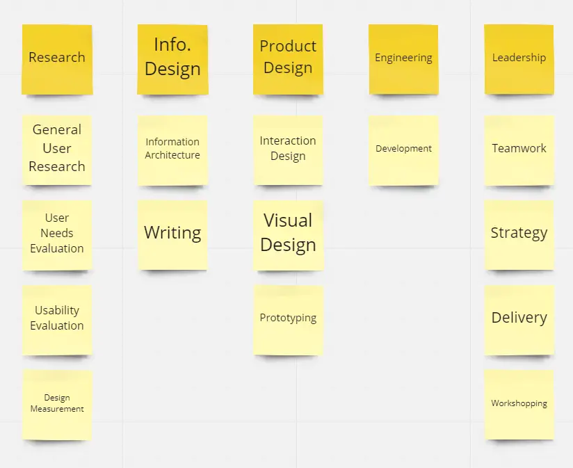
  • What are the skills we feel are most crucial in our space?
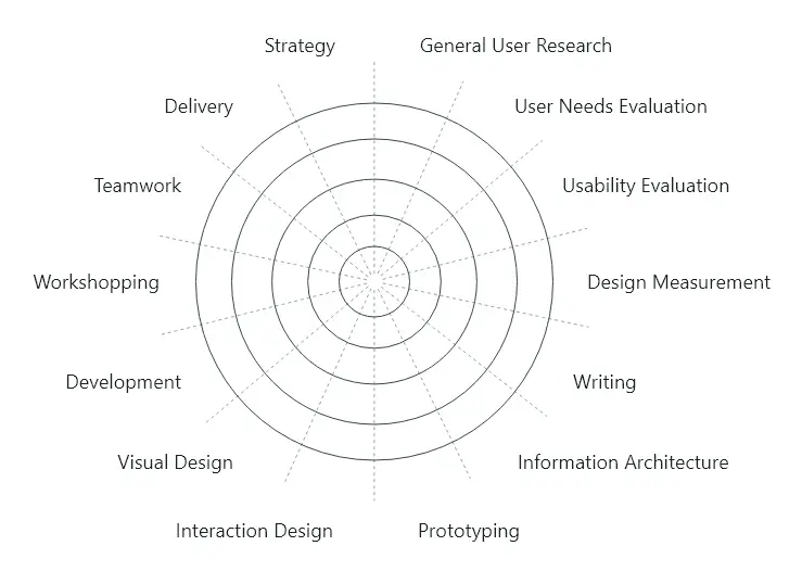
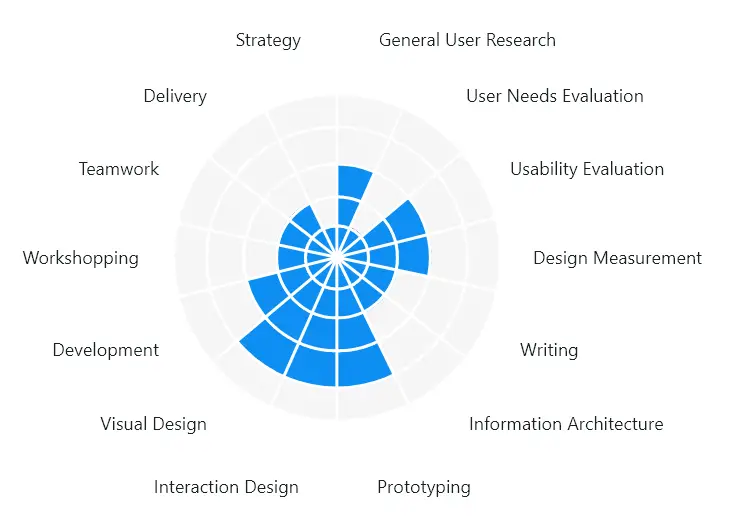
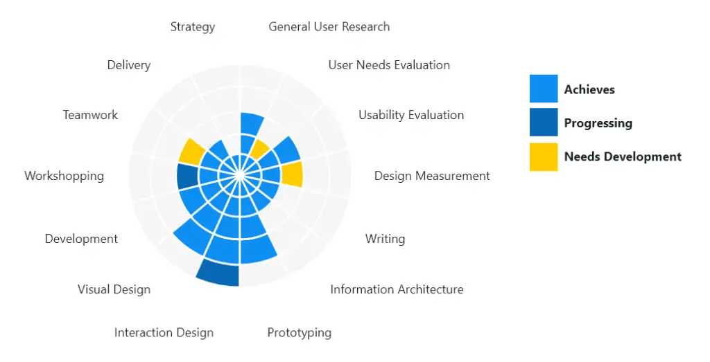
  • How could we visually represent what our designers bring to the table?
  • How could we represent a career trajectory?
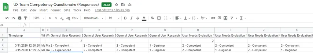
  • What would the process be to evaluate and follow-through on career growth?

The Approach

To tackle the first about the skills necessary, I itemized all of the skills used by our designers into high-level categories. I then did some quick testing to ensure these categories made sense to the people in our org. Once done, I then created detailed cheat sheets explaining what each category entailed.

To address the next question about visually representing information, I did some more research and was inspired by what I had seen done in an unlikely place: professional sports. For years now, analytics have been heavily utilized to communicate tangible proficiencies in athletes. At the NFL Combine for instance, each college athlete’s performance is visualized in a spider chart. This seemed like a natural solution.

Something I didn’t have on my radar is what the different levels within a proficiency scale would need to be. So this took some work but below is what I came up with. A completed spider chart shows the proficiency system in place.

Assessments

I had a system that theoretically worked, but I still had more to do. How would designers be assessed and by whom? The chart only represented proficiencies statically, as if they are either completed or incomplete. I’d also need to consider more nuance like: areas needing development, current progress, and recent achievements. 

To address the assessment issue, I created a series of questions that would be completed by a group of three people: The designer in question, one of their peers, and their supervisor. This was to address removing potential biases like impostor syndrome and to ensure the ratings would be relatively even across the organization.

Tracking Progress

With the system in place and designers having completed their mappings, I then introduced operational improvements to our weekly rhythms with a focus on discussing running goals during our 1:1s. There, we would discuss progress on existing goals, consider creating new goals, removing old ones – at least one of which would be centered on skill development.

The Outcome

Team Engagement Sentiment
+ 0 %
Promotion Rate
+ 20 %

This operational work received praise not just from my team, but was quickly picked up by others also. Soon, the Product Management group was looking to incorporate this approach into their product teams’ ways of working, providing a much needed overview of organizational health.

Numbers don’t lie, and our engagement scores told the story. We saw a positive increase in engagement sentiment (something similar to an employee net promoter score or eNPS), as well as several associates finding their way to promotions shortly thereafter.